Kickin’ Honey
Identity / Packaging / Consulting
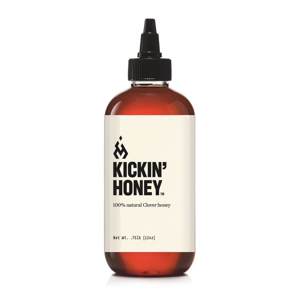
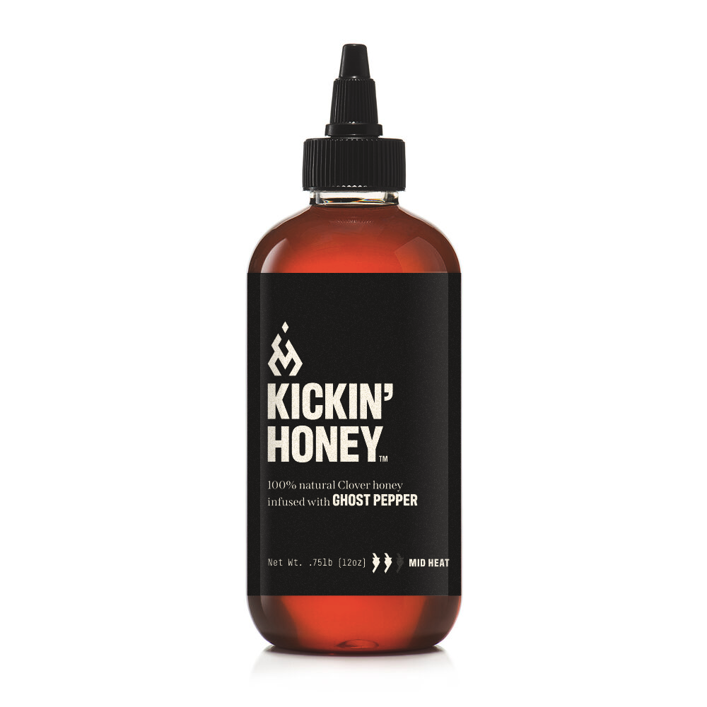
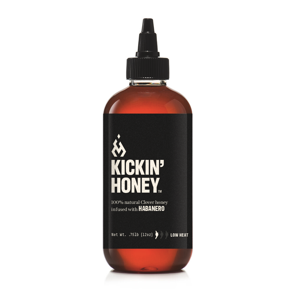
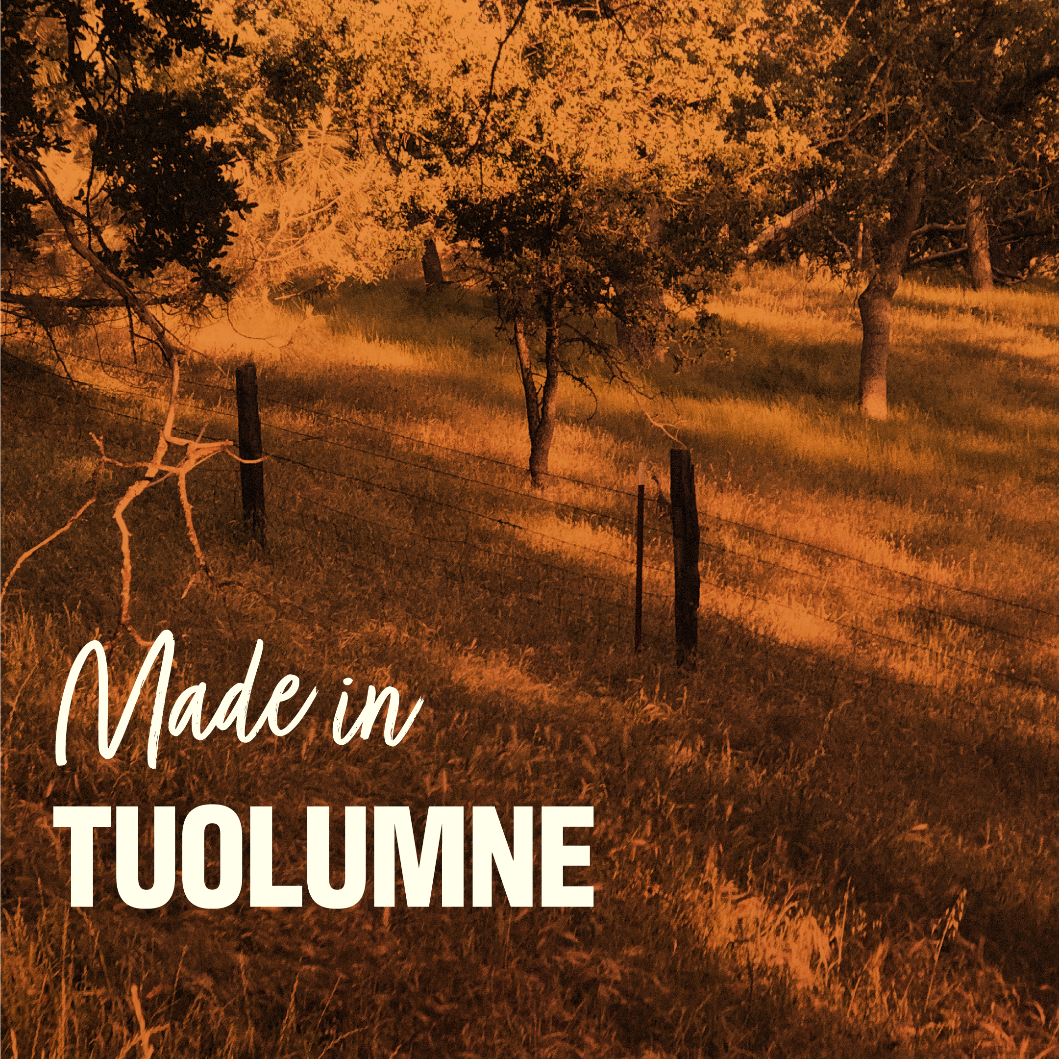
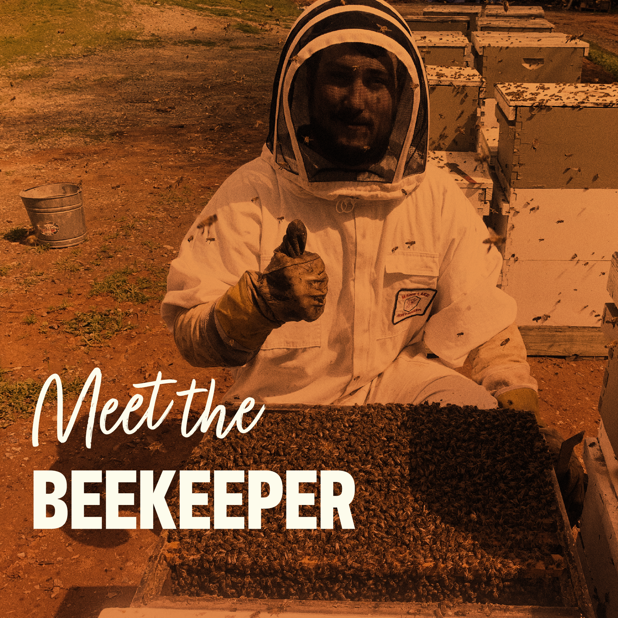
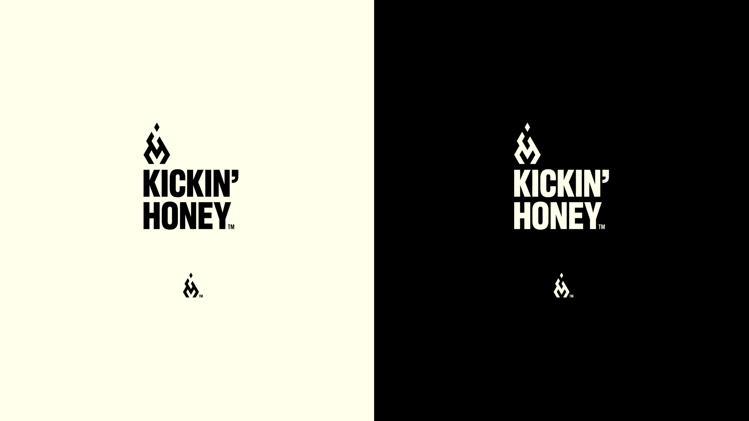
Boutique honey producer, Tuolumne Honey Co., needed an identity and packaging system for their new premium product line of spicy honey. They wanted to target a sophisticated buyer with a curious and daring palate—an adventurous home-cook that would experiment with the novel honey in a cocktail or more complex dishes. The logo is a flame constructed from a hexagonal grid, with a striking bold label that stands out on the shelf. With its playful tone, the tagline “Sweetness that comes out stingin’” alludes to its spicy nature and encourages the consumer to be adventurous.